Liquid Image
Look at the main page of this web site, you will find a photo of me. This image seems pretty normal at first glance, but it has one special feature: if you resize your browser window you can see the photograph’s dimensions adapts to the new column width. Let me explain how this has been done.
We call “liquid” a web site design that adapts itself to the browser window’s size. The image is liquid because its size changes too when the containing column size changes. This is how we do it.
Stylesheet
At first it looks rather simple. All that we have to do is to put an image on the page, while giving it a specific id attribute.
<img src="photo.jpg" id="photo" />
The id allows us to specify a stylesheet rule telling the image use 100% of the current block width:
#photo {
    width: 100%;
    height: auto;
}
As for the image height, it is set to auto. An automatic height will keep original image’s proportions.
(Note: the height attribute is by default set to auto. It is normally not necessary to write it explicitly. I did so here just to make things clearers.)
Image Quality
Now we need to be sure the picture has a sufficient resolution so that it looks good in any reasonable cases. We can guess that the image simply needs to be as big in pixel size as the maximum size we expect it to occupy on the page. Let’s check this.
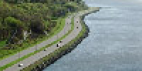
This image makes 250 pixels width. It has been scaled down to a width of 200 pixels using Firefox on Mac OS X and on Windows XP. Observe the result.
| Base Image | |
|---|---|
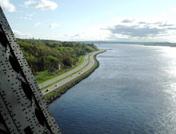 |
| Shrunk on Mac OS X | Shrunk on Windows XP |
|---|---|
|  |

| 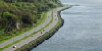 |
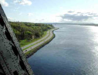
On the Mac as on Windows, the result shows nocks on the edges at regular interval on the image. Look at the zoomed-in version of the road to convince yourself. The phenomenon is easier to see on the image shrunk on Windows.
To downsize the image, the computer needs to remove some horizontal and vertical pixel lines, which produce nicks on oblique lines. If the result is better on the Mac, it’s simply because pixel lines are merged instead of plainly removed.
As a solution to this problem, we will use a bigger base image. The number of pixel lost will be greater when the browser resizes the image, but remaining pixel lines will be better distributed on the image. So we should obtain a better result. Let’s see…
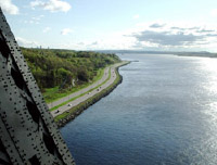
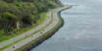
| Base Image | |
|---|---|
 |
| Shrunk on Mac OS X | Shrunk on Windows XP |
|---|---|
 |
 |
 |
 |
First thing to note is that the shrunk image no longer has the nocks it has before. It seems that we reached our goal. Except that there is something else that we should note by looking at differences between the two.
The picture shrunk on Windows is rougher. You may or may not like the effect, however if the picture had small-size details on it — like eyes on a face or the small branches of a tree — the result would not have been good at all. This is what we call aliasing. On the Mac, the picture is scaled down by merging lines, which removes this problem and makes the edges “smoother”.
Another problem is the one of the file size. In fact, base image’s dimensions in pixel have doubled from the first one, which means that we now have four times the pixels we had in the first image. Here, we the file size goes from 100 KB to 140 KB. The difference could be bigger or smaller depending of what you have in the picture: if it can easily be compressed to JPEG then the file size won’t matter much. But in every case, a small file is better than a bigger one.
The Final Solution
How to solve these two problems in one shot? We will make the image blurry. This way we solve the aliasing problem on Windows: it’s just like if we had merged pixels in advance just like the Mac would have done it.
And a blurry image can be compressed more with less quality lost. We can thus use a stronger JPEG compression for our image without really losing quality. Anyway, this won’t matter much since the picture is meant to be shrunk.
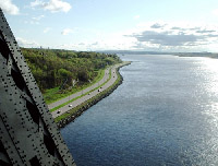
| Base Image | |
|---|---|
 |
| Shrunk on Mac OS X | Shrunk on Windows XP |
|---|---|
 |
 |
 |
 |
Here, it’s the base image that looks the less appealing. However the reduced image on Mac and Windows are of acceptable quality. The result is an image that can adapt to any width, as long as we stay inside a reasonable range.
Mission accomplished.
Still a Problem with IE
As always, Internet Explorer, Windows’ version, has its own problems. Sporadically, the image height is wrong when the page loads. When in this state, a simple action like resizing the browser window gives it back a correct height.
To work around this, we can use a small JavaScript with, as the only goal, force a reflow of the page’s content around it. Here is such a script, a script that in normal circumstances wouldn’t do anything:
<script type="text/javascript">

function reflow() {
    var photo = document.getElementById("photo");
    photo.style.border = photo.style.border;
}

window.onload = reflow;

</script>
If you reload repeatedly the home page of my web site with Internet Explorer, you should be able to see the phenomenon of higher-than-should-be photograph that takes back the right height as soon as the script is run.
Conclusion
So that’s it. We saw that it’s not too much complicated to make a liquid image. The CSS rule width: 100% is almost all it takes. But work around an Internet Explorer you will need to add a small script that will force it to reflow the page once it’s loaded, otherwise we gets sporadically a distorted image with too much height.
The second thing to remember is that when the browser shrunk the image itself, we should provide a bigger base image. To keep the reduced image nice everywhere, it is a good idea to make the base image blurry a little. A blurry image is good for JPEG compression, so you may use that to reduce the file size.
That’s all. I hope that you liked my little tricks about liquid images.
Comments
Interesting.
The example on the home page works well. I like it.
Interesting alternative for using photographs with non-fixed layouts. (I’d probably call this ‘elastic image’ myself.) Of course the image quality is not as good as it would be if the image was prepared by a professional at the specific size required, but the quality is good. I think graphic designers from the print world can equate this to preparing images for halftone screens.
“Elastic image”… Hum, I think you are right, it would have been a better name.
Excellent idea. Thank you for sharing. :D
Interesting idea(s).
Although you’ve misused “loosing” since it is [which contracts to it’s (for possessive “its”, leave out the apostrophe)] the term use to describe releasing the string and arrow whilst in the pursuit of archery.
Thanks, Chris. I have corrected the typo. Now it’s losing.
Interesting, I’ll have to try it out, but what’s a good way to tell how much blurriness to use w/o spending hours in photoshop just to post a single picture to your website?
btw: “Widnows XP” - Last Line, 2nd Paragraph, ‘Image Quality’ Section.
This is a good question Dave. I do not have a very well thought answer for this currently, but I know the blurriness needed is linked to the average shrinking ratio you expect your viewers will get.
I would like to add that I’m unsure a gaussian blur is the ideal filter for this kind of effect. It’s not too bad really, but another way would be to take the image at the resolution you expect it to be shown and enlarge it with bicubic interpolation. The kind of blur resulting from this is different than a gaussian blur, and it could be better-suited for this task. I haven’t tried that much yet.
I didn’t bookmark this page, but was pleased to find it at the top of the results on Google for “liquid image”. I’m linking to if from a presentation I am giving on CSS today for a Graphic Design class.
The primary problem is that web browsers simply don’t resize images very well. This is often due to using a technique called “nearest neighbor pixel resizing” it’s fast, but the quality is horrible. For a true representation one needs to look at basic line designs rather than a photograph: http://www.backwater-productions.net/_test_platform/shapes2.html
As you can see, either bigger or smaller, there is a great deal of image distortion. So the idea is to use a better image resizing method, such as bilinear or bicubic resizing. PHP has this ability. However PHP does not have the ability to detect the screen width. JavaScript has this ability, but does not have the ability to properly resize. So the solution is simple…a hybrid of PHP and JavaScript to produce a TRUE liquid image: http://www.backwater-productions.net/alt.2600/liquid/index.html
Resize your browser window any way you like and hit refresh, the image is setup to auto resize to the browser width while maintaining a CLEAR and properly resized image.
The site works by running a JavaScript to detect the width and write it to a cookie and then the cookie is picked up by the PHP code for use in resizing the image. The html code then generated by the JavaScript outputs the PHP file as an image and viola, a PERFECT liquid image.
Onideus: Thanks for sharing this pretty interesting technique. You are right, my liquid image technique is less appropriate for logos with sharp lines and more for photographs.
Your gives pretty good results, but from what I can see has two drawbacks: it needs JavaScript and cannot handle live resizing well. It is probably a little harder to install initially too and require much more processing from the server. But I’m sure it has its uses.
Michel Fortin is jelous
Actually Michel’s way is a bit easier and a much more viable solution unless you want to put in the effort to create your own templates to easily employ my method. My method requires an in depth understanding of HTML, JavaScript and PHP. It’s superior in function, but not as easy to implement.
Also my prototype is far from perfect. I need to modify it to support PNG alpha transparencies as well as other image formats, the JavaScript needs an onresize metarefresh function and the overall implimentation could be tweaked, like using GET variables rather than cookies.
Reaper also suggested encapsulating each pic in a class and cache it in the user session. That way, the pic won’t have to reload every time the user hits the server (within the same session).
Also, I personally would like to see some other methods posted (if there are any), as this is a subject that’s not widely covered and yet has many practical uses. My current project is to use my method to develop the first TRUE liquid website, in which every single element autoresizes depending on the browser size and looks EXACTLY the same…essentially zooming in and out of the page depending on the res.