Time Machine Translation Mess
In Mac OS X Leopard, I couldn’t help noticing the French translators had a hard time to fit everything in the preference panel. They had to change the layout a bit to accommodate longer text bits, but the final result isn’t too bad. That panel hardly changed in Snow Leopard in its English version, but the French translators redid the whole layout and, this time, in a very messy way. Let’s take a look.
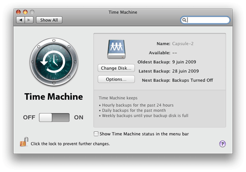
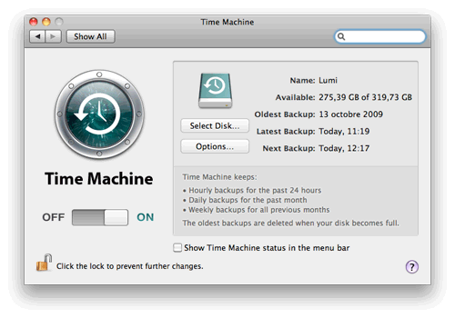
The appearance of the preference panel changed little between Leopard and Snow Leopard, as you can see in the following figure. They changed slightly the descriptive text and that’s all.
Figure 1: English Time Machine preference panel on Leopard and Snow Leopard. Notice the subtle evolution.
Now, take a look a the same preference panel in French. Figure 2 show the Leopard version.
Figure 2: French Time Machine preference panel on Leopard. French doesn’t let as much room as English and things got squeezed a little.
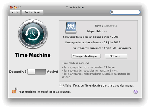
Here you can observe that the text labels take much more space, not enough in fact for the virtual column in English encompassing the disc icon and the buttons. The disk icon was pushed up a little and buttons were moved down and aligned horizontally to leave enough room for the text. It’s hard to notice on the screen shots, but the window has been made a little taller too.
On the left size, you can see how difficult it was to put the text labels around the switch control. The result feels a little squeezed, but that’s probably the best they could do given the length of the text labels. And also, for no apparent reason, the Time Machine logo was moved up.
So, it’s hard not to notice the sleek original design in English is being squeezed up a little, but let’s accept that as a good compromise and move on to Snow Leopard.
Figure 3: French Time Machine preference panel on Snow Leopard. Apparently, someone redid the job in a worse way.
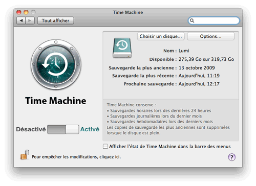
Hum, whoever did this screwed up that panel. I mean, the idea to put the buttons on the top isn’t so bad as it can make the icon look a little less squeezed (compare to the Leopard version in figure 2), but it was done pretty poorly:
- there is no space between the containing box and the buttons at the top;
- the box doesn’t respect the spacing standards on the top and right edges;
- despite this, there is plenty of space inside the box for moving the text labels down and give proper spacing to everything, giving no excuse for the above.
It’s funny how that panel looks unAppleish; it looks like it has been done in a rush, that or with little care which is unusual for Apple.
But it also shows another aspect of the difficulty in software localization through various interface revisions. Here, someone at Apple made some changes to the original English interface description file, adding some text in the Time Machine’s description part. Then, the file has been recopied from its English version then translated again, entirely, and the layout had to be readapted, again.
Recopying then retranslating from the English version, that’s to avoid problem number 2 described by Wil Shipley in Lost in Translation. To summarize, the interface file also contains a functional part of the software. By always retranslating from the version the developers are working on, we make sure that everything else stay synchronized between files of different languages.
In this case, starting from the previously localized file would probably have worked with no problem, but the translator probably has a proper procedure to follow. That doesn’t make it an excuse for the poor result though.
Comments
I stopped using the French version of Mac OS (pre-OS X, maybe it was 8) when I discovered that the localisation introduced bugs that were not present in the U.S. version, bugs that took much longer to be fixed because they only affected a small portion of users (the French-speaking ones) and depended on the probably quite small French-localisation team instead of the big U.S. unit.
Yup, that’s a horrible control panel and like you say, the sad thing is that it looks like there’s lots of space to make it better!
Just move everything in the ”upper section” (lighter gray) down a bit so the ”Choisir un disque…” and ”Options…” buttons get some space above.
Also it would look a lot better if the font size for the text ”Désactivé” and ”Activé” was decreased a little.
One thing they could do for the OFF/ON switch in French is to do what they did for the iPhone: change it to an 0/1 switch. But perhaps given that it’s the only instance of such a switch in Mac OS X they though the meaning wouldn’t be very clear.