Liquid Image
Look at the main page of this web site, you will find a photo of me. This image seems pretty normal at first glance, but it has one special feature: if you resize your browser window you can see the photograph’s dimensions adapts to the new column width. Let me explain how this has been done.
We call “liquid” a web site design that adapts itself to the browser window’s size. The image is liquid because its size changes too when the containing column size changes. This is how we do it.
Stylesheet
At first it looks rather simple. All that we have to do is to put an image on the page, while giving it a specific id attribute.
<img src="photo.jpg" id="photo" />
The id allows us to specify a stylesheet rule telling the image use 100% of the current block width:
#photo {
    width: 100%;
    height: auto;
}
As for the image height, it is set to auto. An automatic height will keep original image’s proportions.
(Note: the height attribute is by default set to auto. It is normally not necessary to write it explicitly. I did so here just to make things clearers.)
Image Quality
Now we need to be sure the picture has a sufficient resolution so that it looks good in any reasonable cases. We can guess that the image simply needs to be as big in pixel size as the maximum size we expect it to occupy on the page. Let’s check this.
This image makes 250 pixels width. It has been scaled down to a width of 200 pixels using Firefox on Mac OS X and on Windows XP. Observe the result.
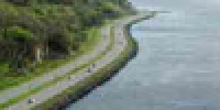
| Base Image | |
|---|---|
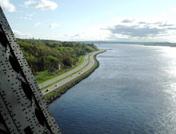 |
| Shrunk on Mac OS X | Shrunk on Windows XP |
|---|---|
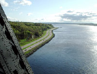
|  |

|  |
On the Mac as on Windows, the result shows nocks on the edges at regular interval on the image. Look at the zoomed-in version of the road to convince yourself. The phenomenon is easier to see on the image shrunk on Windows.
To downsize the image, the computer needs to remove some horizontal and vertical pixel lines, which produce nicks on oblique lines. If the result is better on the Mac, it’s simply because pixel lines are merged instead of plainly removed.
As a solution to this problem, we will use a bigger base image. The number of pixel lost will be greater when the browser resizes the image, but remaining pixel lines will be better distributed on the image. So we should obtain a better result. Let’s see…
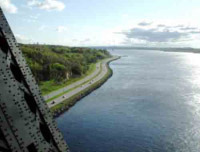
| Base Image | |
|---|---|
 |
| Shrunk on Mac OS X | Shrunk on Windows XP |
|---|---|
 |
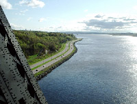 |
 |
 |
First thing to note is that the shrunk image no longer has the nocks it has before. It seems that we reached our goal. Except that there is something else that we should note by looking at differences between the two.
The picture shrunk on Windows is rougher. You may or may not like the effect, however if the picture had small-size details on it — like eyes on a face or the small branches of a tree — the result would not have been good at all. This is what we call aliasing. On the Mac, the picture is scaled down by merging lines, which removes this problem and makes the edges “smoother”.
Another problem is the one of the file size. In fact, base image’s dimensions in pixel have doubled from the first one, which means that we now have four times the pixels we had in the first image. Here, we the file size goes from 100 KB to 140 KB. The difference could be bigger or smaller depending of what you have in the picture: if it can easily be compressed to JPEG then the file size won’t matter much. But in every case, a small file is better than a bigger one.
The Final Solution
How to solve these two problems in one shot? We will make the image blurry. This way we solve the aliasing problem on Windows: it’s just like if we had merged pixels in advance just like the Mac would have done it.
And a blurry image can be compressed more with less quality lost. We can thus use a stronger JPEG compression for our image without really losing quality. Anyway, this won’t matter much since the picture is meant to be shrunk.
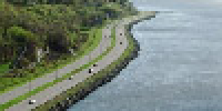
| Base Image | |
|---|---|
 |
| Shrunk on Mac OS X | Shrunk on Windows XP |
|---|---|
 |
 |
 |
 |
Here, it’s the base image that looks the less appealing. However the reduced image on Mac and Windows are of acceptable quality. The result is an image that can adapt to any width, as long as we stay inside a reasonable range.
Mission accomplished.
Still a Problem with IE
As always, Internet Explorer, Windows’ version, has its own problems. Sporadically, the image height is wrong when the page loads. When in this state, a simple action like resizing the browser window gives it back a correct height.
To work around this, we can use a small JavaScript with, as the only goal, force a reflow of the page’s content around it. Here is such a script, a script that in normal circumstances wouldn’t do anything:
<script type="text/javascript">

function reflow() {
    var photo = document.getElementById("photo");
    photo.style.border = photo.style.border;
}

window.onload = reflow;

</script>
If you reload repeatedly the home page of my web site with Internet Explorer, you should be able to see the phenomenon of higher-than-should-be photograph that takes back the right height as soon as the script is run.
Conclusion
So that’s it. We saw that it’s not too much complicated to make a liquid image. The CSS rule width: 100% is almost all it takes. But work around an Internet Explorer you will need to add a small script that will force it to reflow the page once it’s loaded, otherwise we gets sporadically a distorted image with too much height.
The second thing to remember is that when the browser shrunk the image itself, we should provide a bigger base image. To keep the reduced image nice everywhere, it is a good idea to make the base image blurry a little. A blurry image is good for JPEG compression, so you may use that to reduce the file size.
That’s all. I hope that you liked my little tricks about liquid images.
 Everyone knows about